Deep Dive
LiveBuilding Itiner: From Hackathon Prototype to B2B SaaS
How a hackathon idea became a workflow product for travel agents who need calm, premium client output.
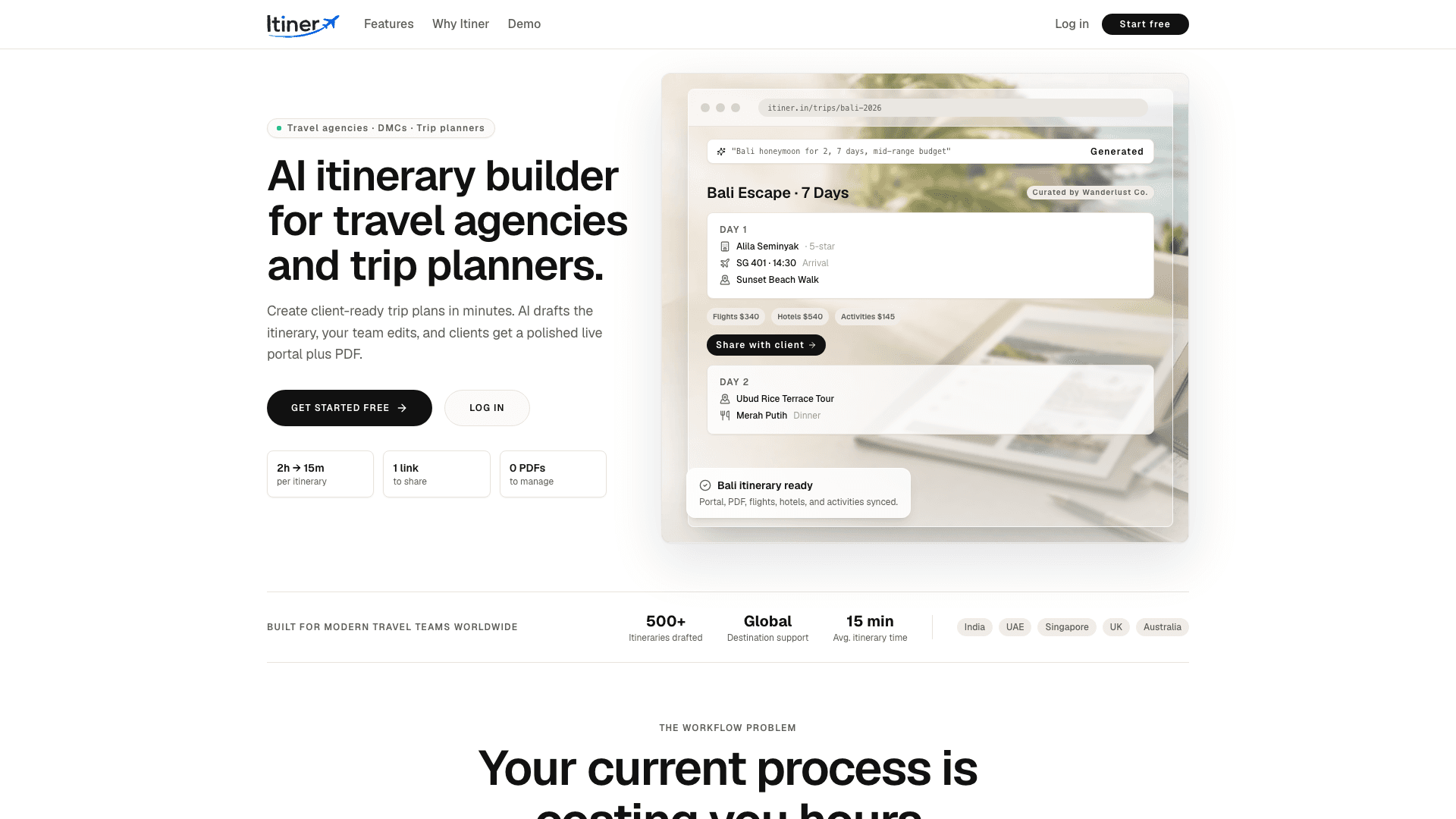
The Problem
Travel agents were building itineraries across Canva, Google Docs, and WhatsApp. The process was fragmented, slow, and hard to keep in sync.
What I Built
Built a workflow where AI drafts the structure, the agent refines the trip, and the client receives a polished portal and exportable output.
Where It Stands
Itiner is live and still being shaped around real use. The core direction is stable: AI assists, the agent stays in control, and the output should feel premium.
Stack
The Article
Why it existed
Itiner started because travel agents were still building expensive, polished client journeys inside tools that were never designed for that job. The work was scattered across docs, chat apps, design tools, and memory. It felt chaotic, and the final result never matched the effort going into it.
What bothered me most was that the output mattered a lot. A travel designer is not just sending information. They are selling taste, reassurance, and a sense of care. Yet the tools they were using made that work feel administrative instead of premium.
That mismatch was the core reason I kept pushing the idea. The value was clearly there, but the experience of making the thing was too fragmented to support the standard of work the agents wanted to deliver.
I wanted to build something that respected the actual craft of trip design. The product had to feel calm, visual, and useful without stepping on the agent’s role.
The problem I was solving
The real problem was not “make an itinerary.” It was “help a travel designer move from rough trip idea to something client-ready without turning the process into admin work.” The product had to support taste, editing, and presentation without trying to replace the agent.
That distinction mattered because a lot of AI products in this space try to be the whole answer. I did not want that. The best outcome was a tool that could help the agent move faster while still leaving room for curation and judgment.
I also had to think about the client side. The end result could not look like internal working notes. It had to feel like something a travel professional would want to share with a paying customer.
That was a useful constraint because it kept me honest about design. If a screen looked useful to me but would feel low-end to a client, it was the wrong screen.
The first version
The first version was built like a prototype with ambition. I wanted to prove the loop: generate a useful trip structure, let the human refine it, then produce something that could be shared without embarrassment.
At that stage, I was mostly trying to answer a single question. Could a software product make the travel designer feel faster without making them feel replaceable?
The answer was only meaningful if the workflow stayed editable. So the first version was intentionally closer to a studio tool than a one-click AI generator.
That meant I had to resist the temptation to make the prototype feel too magical. The more autonomous the product looked, the more it risked becoming the wrong product for the people I was actually trying to help.
Tech stack and decisions
The stack stayed aligned with the rest of the portfolio: Next.js, TypeScript, PostgreSQL, and AI where it actually helped. I did not want an experimental pile of services. I wanted a product I could reason about while shipping quickly.
The biggest design decision was to keep AI as the drafting layer and not the final author. That made the product calmer and easier to trust.
That also let me design the interface around review, adjustment, and polish instead of a magical generate button.
I also spent time thinking about information hierarchy. In workflow software, the user should not have to hunt for the next step. The layout has to make the next action obvious because the user is usually already juggling a lot.
Problems, bugs, and pivots
The biggest pivot was accepting that AI should assist structure, not author the whole trip. That change made the product calmer and more honest. The build also had to survive the usual workflow-software problems: too many states, too many edge cases, and too much temptation to clutter the interface.
A lot of the debugging effort went into making the experience feel fluid even when the underlying data was messy. Travel information has a habit of becoming weird very quickly, so the UI had to absorb that complexity without letting it leak all over the page.
The practical lesson was that workflow products need more restraint than excitement. If the interface starts feeling busy, users stop trusting it. If it feels too empty, they do not understand what to do next. The fix is usually clarity, not more features.
That lesson kept repeating across the build. The product got better when I removed unnecessary choice, not when I added more customization.
What the build felt like
Itiner was one of those builds where the product kept reminding me that workflow software has to feel calm before it can feel smart. If the interface gets noisy, the whole experience starts to fight the user.
I kept having to choose between “impressive” and “usable,” and the right answer was almost always usable. That made the work feel slower in the short term, but cleaner in the end. It also made me respect how much of travel design is emotional labor, not just formatting data.
A few specifics
The longer I worked on it, the more I understood that trip design software needs to protect taste. If the tool makes every trip look the same, it destroys the very thing the travel agent is selling.
So even when I simplified the workflow, I kept looking for places where the product could preserve personality instead of flattening it.
What I’d change next
If I had more time on this version, I would spend it on faster editing, better saved templates, and more obvious ways to carry a travel designer’s style through repeated work.
The product already feels more coherent than the first prototype. The next step is making it even easier to reuse without making it feel templated or generic.
What I learned
- If the user is a professional, the product should make them look better, not make them irrelevant.
- Presentation matters in workflow software because the output is part of the value.
- The best AI feature is often the one that reduces empty work, not the one that does everything.
What’s next
The next version should keep improving client-facing polish, faster editing, and the small details that make the product feel like a real travel studio tool instead of a demo.
I want the product to feel more like a quiet advantage inside a travel business than a separate piece of software people have to think about every time they use it.
If I keep pushing this, the best version of Itiner is one where the software disappears into the workflow and the quality of the output is what people notice first.
The long-term version should make a travel designer feel like they have a better internal system, not just another app open in the browser.
What the product is really selling
The software is not really selling itinerary generation. It is selling confidence. A travel designer needs to feel that the trip they are sharing is organized, premium, and easy for the client to understand.
That is why the output format matters so much. If the output looks polished, the agent can move with more confidence. If the output feels rough, the client starts reading uncertainty into the whole experience.
I tried to design around that reality instead of pretending the app was only about data entry or draft generation. In practice, the product is part workflow tool and part presentation layer.
That is a useful combination because it respects the fact that travel is emotional. The output is not just information. It is part of the service.
How the hackathon origin changed the product
The fact that Itiner started as a hackathon idea is still visible in the product, but in a good way. Hackathons force you to make the core idea legible fast, and that helped me avoid overcomplicating the first version.
What changed over time was the seriousness of the workflow. Once the prototype was useful, I had to make it feel like a tool someone could actually depend on rather than just a neat concept.
That transition required a lot of quiet refinement. More structure. Better copy. Cleaner hierarchy. Fewer assumptions about what the user would figure out on their own.
That is usually how prototypes become products: the original idea stays intact, but the rough edges get replaced by judgment.
Why human-in-the-loop matters here
I am still convinced that human-in-the-loop is the right model here because travel design is not a pure automation problem. It is a judgment problem wrapped in a service business.
The agent knows the client. The agent knows the style. The agent knows what should be emphasized and what should be omitted. The software should help organize that expertise, not replace it.
That belief affected the entire build. It kept me from over-automating the content generation and pushed me toward a system where the human remains in control of the final shape.
The product feels better because of that decision. It respects the person using it instead of trying to outgrow them.